Granville Island: UX Research & Redesign
PROJECT OVERVIEW
Who are the users? Granville Island visitors—tourists and locals seeking shops, restaurants, and events.
What was the goal? Testing whether our design assumptions actually solved visitor problems through structured user research.
How did we approach it? Interviewed 5 people who'd visited Granville Island, testing our prototype and evaluating three hypotheses about parking, loyalty programs, and personalization.
Where was it used? Research conducted remotely. Design focused on mobile and desktop experience for planning and on-site navigation.
When did this problem happen? Visitors face these challenges every time they plan or explore Granville Island—struggling to find parking information, discover relevant activities, and navigate the area without feeling overwhelmed or missing hidden gems.
Why did this matter? To validate assumptions with evidence—determining what to keep, pivot, or discard before finalizing the redesign.
PROJECT CONTEXT
Timeline: 4 weeks (2 phases)
Team: 3 people
My role:
UX Researcher: conducted user interviews, validated assumptions, synthesized insights
Visual design revisions
Deliverables: Research validation, revised wireframes, interaction design changes
THE CHALLENGE


The challenge: Validate our assumptions about these features by gathering insights from real users—ensuring our redesign improved user experience and engagement, not just our opinions.
How might we enhance the user experience through real audience insights, improve website usability and accessibility, and encourage users to return more often while building a stronger connection with Granville Island?
RESEARCH & INSIGHTS
We began with turning previous assumptions into hypotheses for testing:
Parking assistance would drive more visits
Loyalty programs would build community connection
Personalization could balance planning + spontaneity
Methods: Structured interviews with 5 users who've visited Granville Island, task-based testing of wireframes, feedback analysis
Key Findings
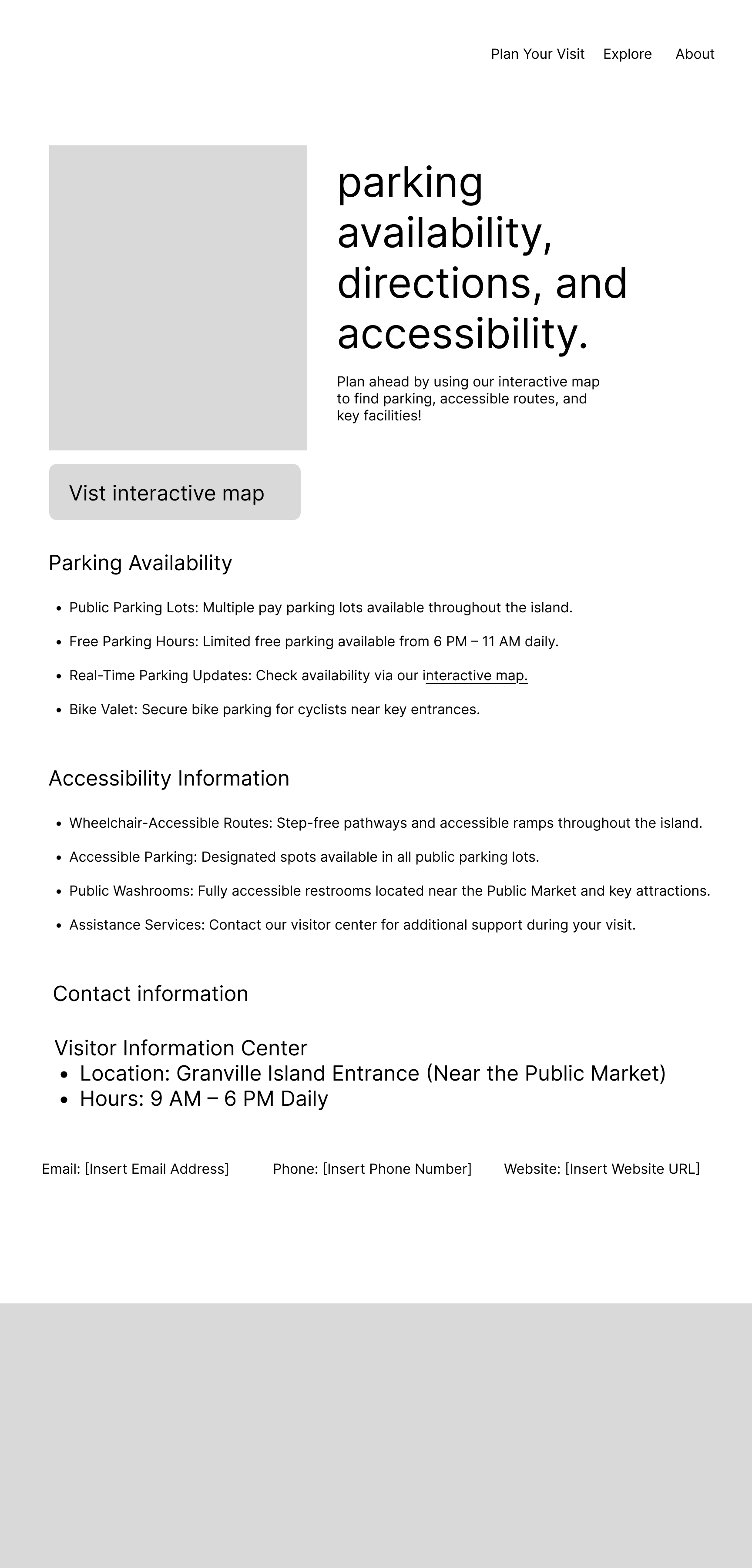
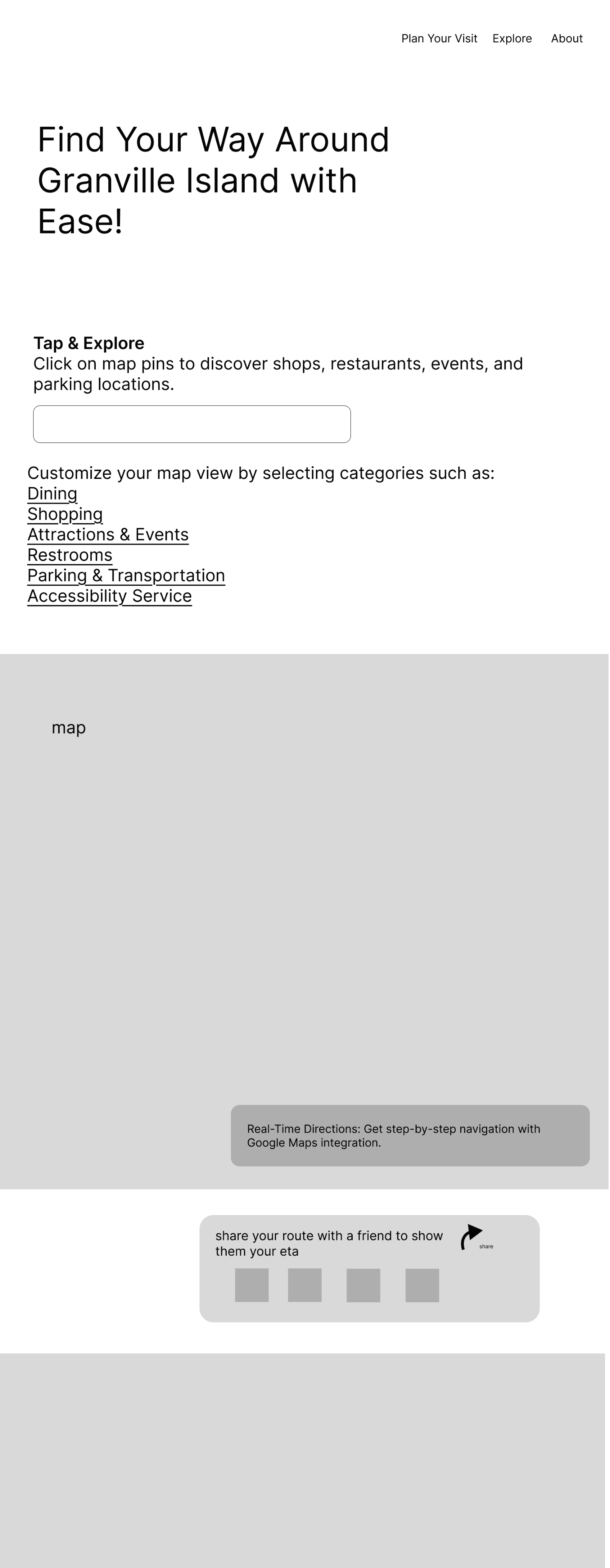
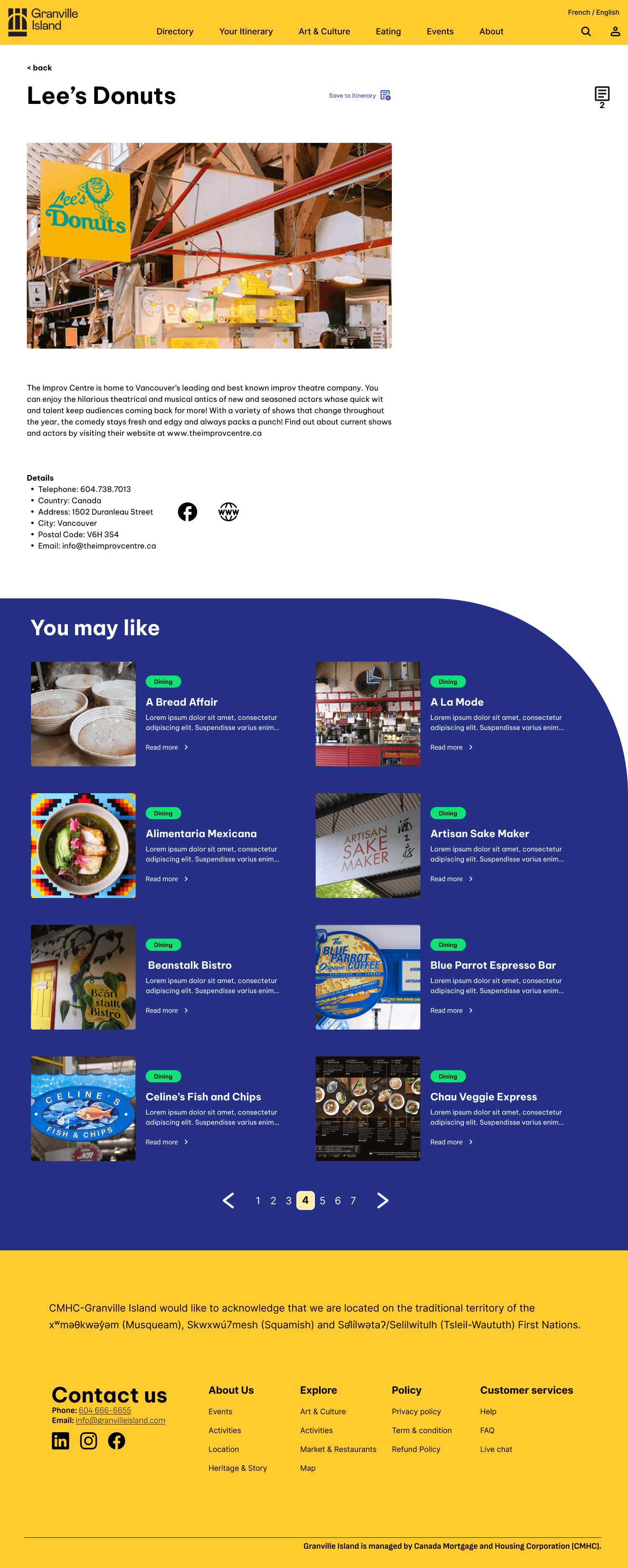
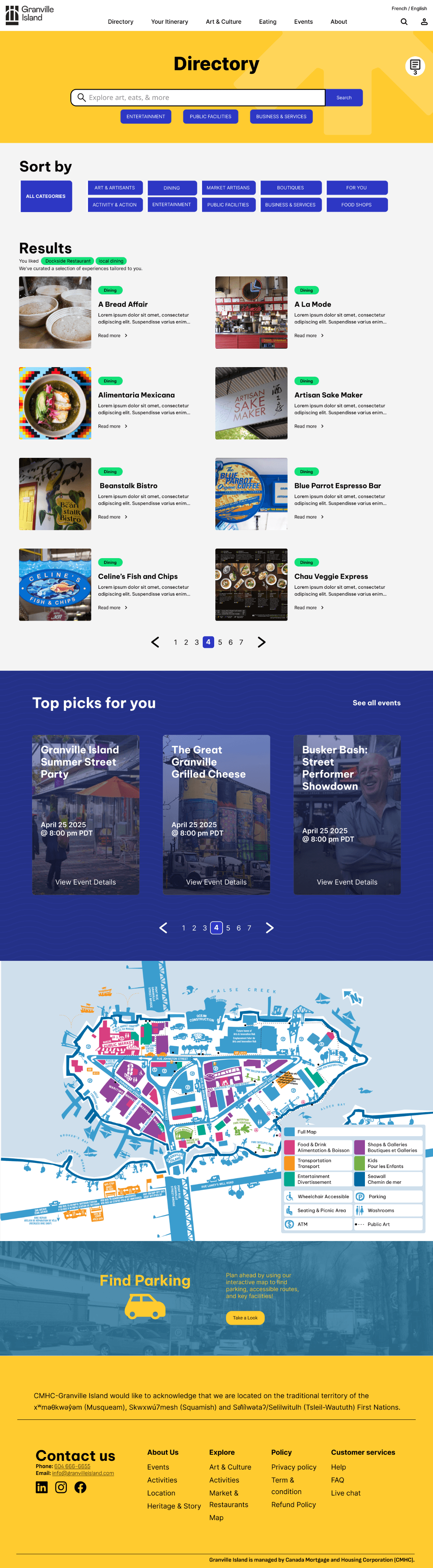
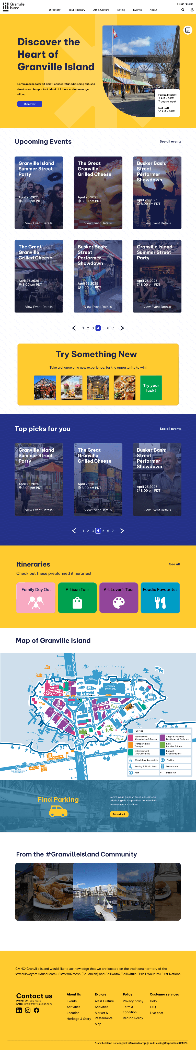
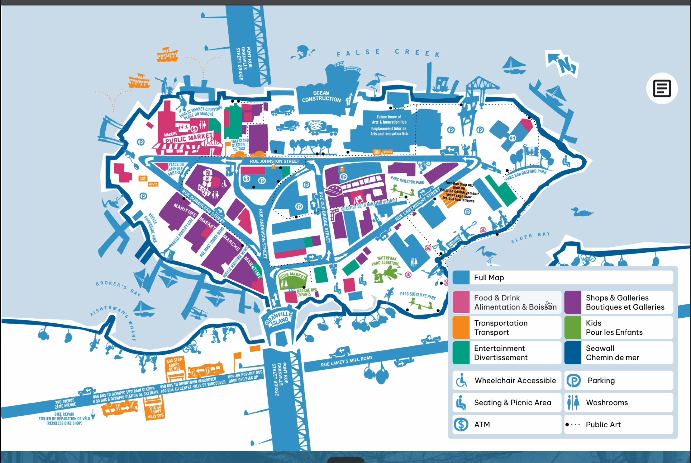
Parking is the #1 pain point:
Real-time updates + map filters strongly validated, but our module placement failed—it was hidden in the wireframes when users needed it on the homepage.
Coupons > Loyalty programs:
Users loved deals but rejected long-term loyalty commitments. They saw loyalty programs as pressure and obligation.
Community is witnessed, not joined
People enjoy community atmosphere without needing to feel like members.
Observing local culture matters more than participating in it.
Old + new coexist
Visitors return to favorite spots but also explore new shops—they don't choose one or the other.
Balance matters
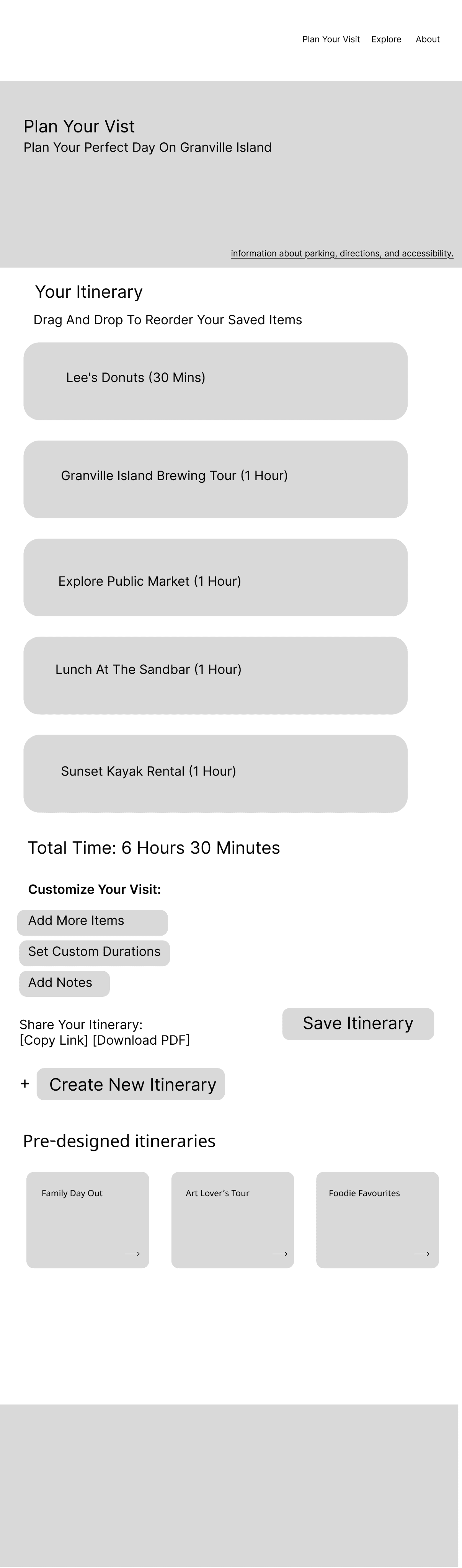
Itineraries useful as inspiration, not strict plans. Users wanted flexibility to adapt spontaneously.
PERSONA
Name: Mike Thompson, 45
Occupation: Freelance Graphic Designer
Pain Points:
Dislikes loyalty commitments
Hard to track island events
Sticks to familiar spots
Needs:
Flexible perks without commitment
Easy event information access
New experience suggestions
Behaviors:
Visits sporadically
Enjoys spontaneous trips
Appreciates community atmosphere
Goals:
Support local businesses
Find unique items
Stay informed about events
Name: Sarah Chen, 32
Occupation: Marketing Manager
Pain Points:
Frustrated by difficult parking
Limited time for planning
Overwhelmed by too many options
Needs:
Real-time parking information
Personalized recommendations
Easy planning tools
Behaviors:
Visits monthly
Uses smartphone for planning
Enjoys mix of favorites and new spots
Goals:
Find parking easily
Discover new shops and restaurants
HYPOTHESIS VALIDATION
Hypothesis 1: Parking Assistance — ✓ STRONGLY VALIDATED
Users consistently reported parking frustration and saw immediate value in real-time updates.
Hypothesis 2: Perks + Loyalty Programs — ~ PARTIALLY VALIDATED
Coupons validated strongly, but loyalty programs received lukewarm reactions. Community connection less important than we assumed—users wanted to witness it, not join it.
Hypothesis 3: Discovery & Personalization — ✓ VALIDATED WITH NUANCE
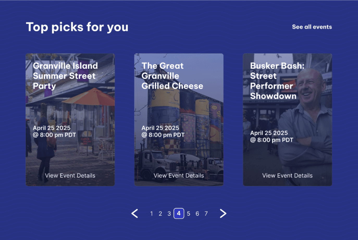
Users wanted personalization AND flexibility—not rigid plans. "Top Picks for You" resonated strongly. Itineraries should inspire, not dictate.
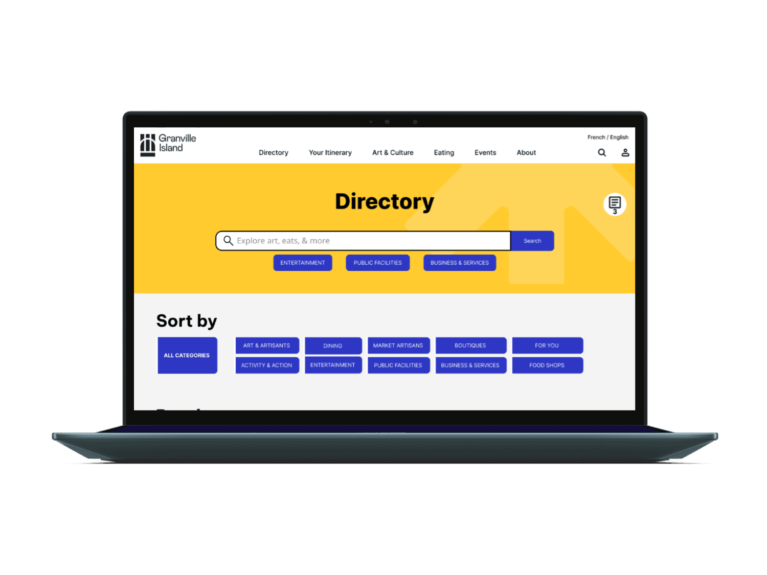
INITIAL WIREFRAME
Initial Wireframe
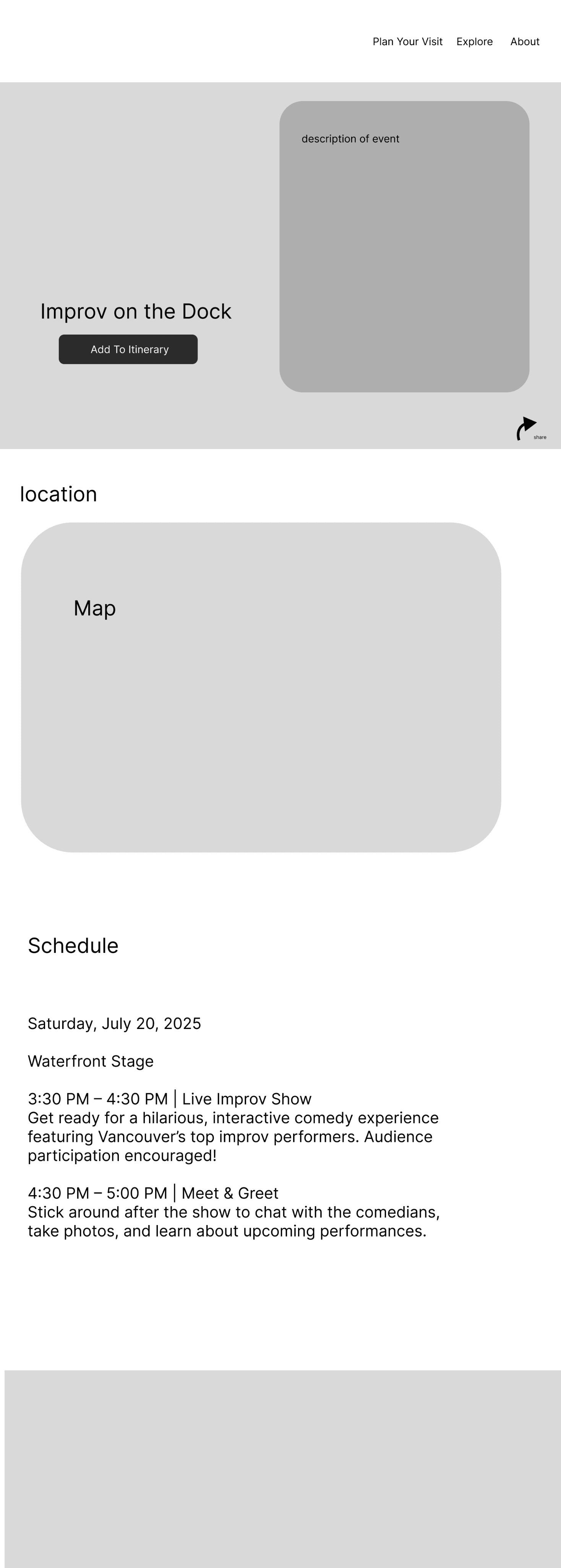
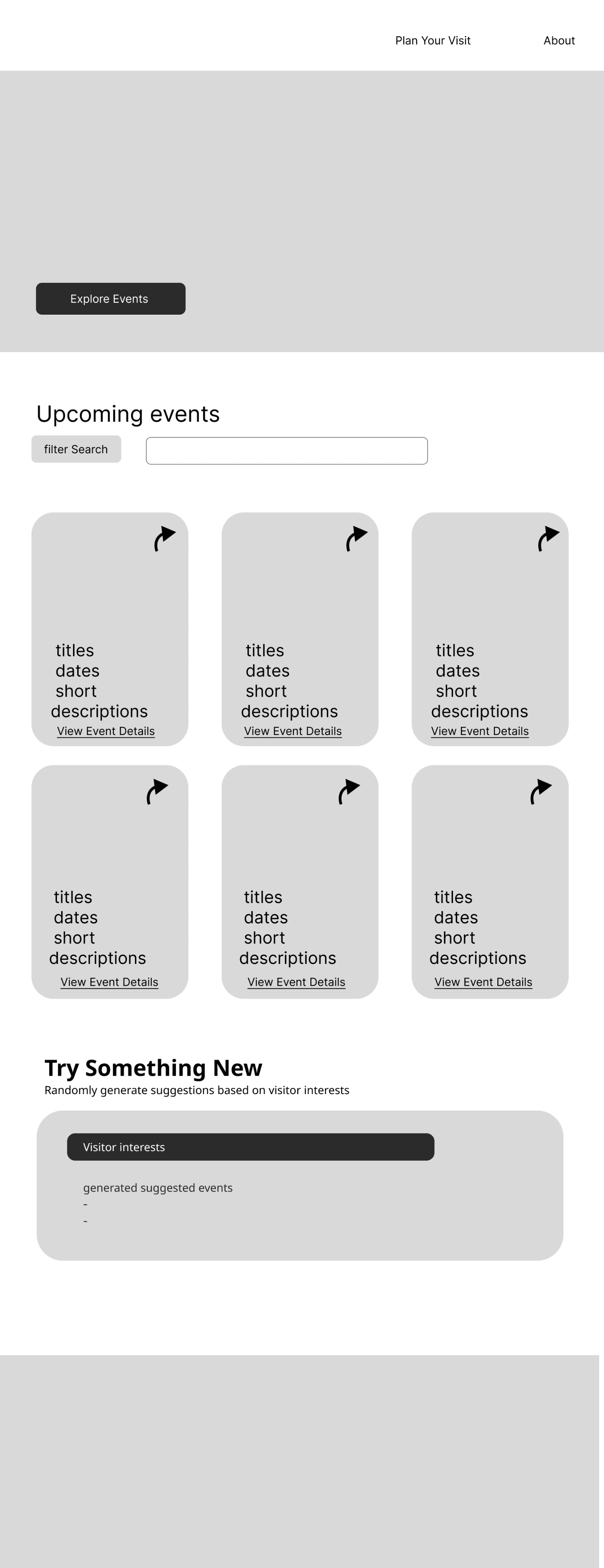
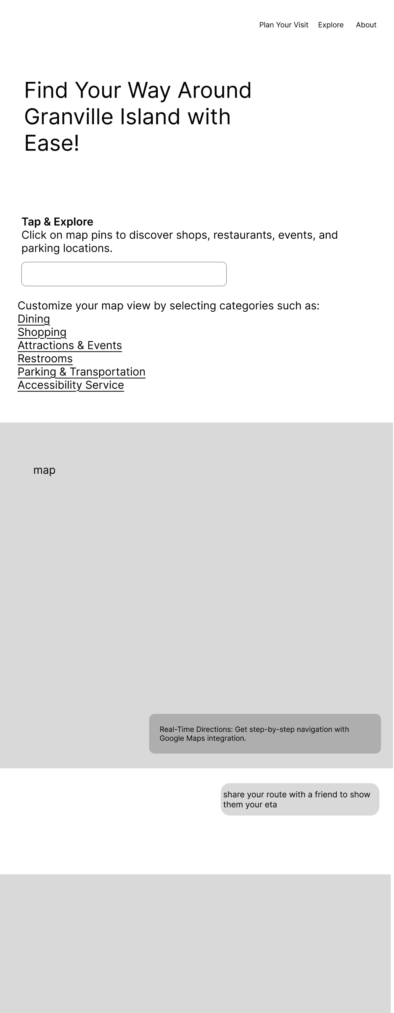
Final outcome

DESIGN CHANGES MADE
Parking assistance would drive more visits
Personalization helps users plan while maintaining flexibility to explore spontaneously
Replaced loyalty infrastructure with seasonal/event-based coupons

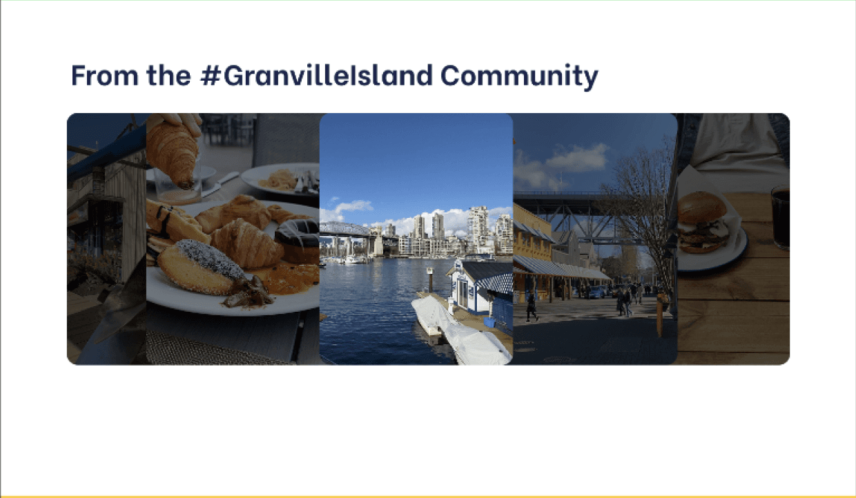
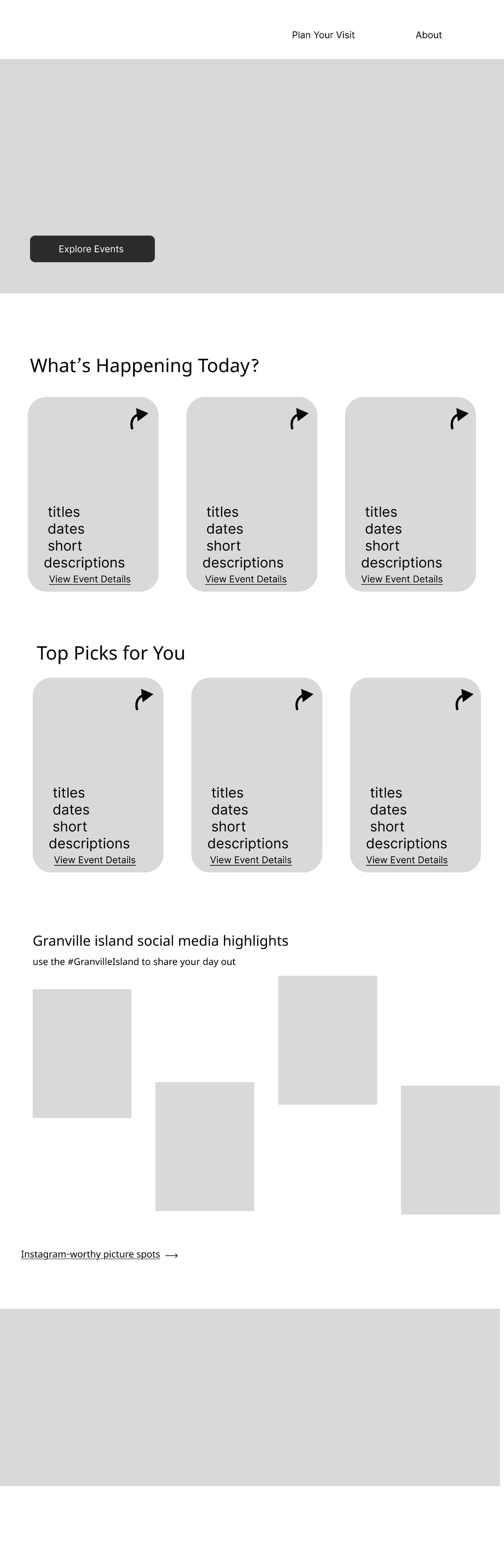
Removed social media emphasis, kept high-quality scenic imagery
Made itineraries customizable and adaptable

RESULTS & LEARNINGS
User research can really change our perspective on assumptions. Features that seemed obviously valuable—loyalty programs, Instagram photo spots—fell flat with actual users. Meanwhile, simpler solutions like coupons and prominent parking visibility resonated strongly. Testing early prevented us from investing design effort into features users didn't want. Evidence-based design decisions always beat assumptions.